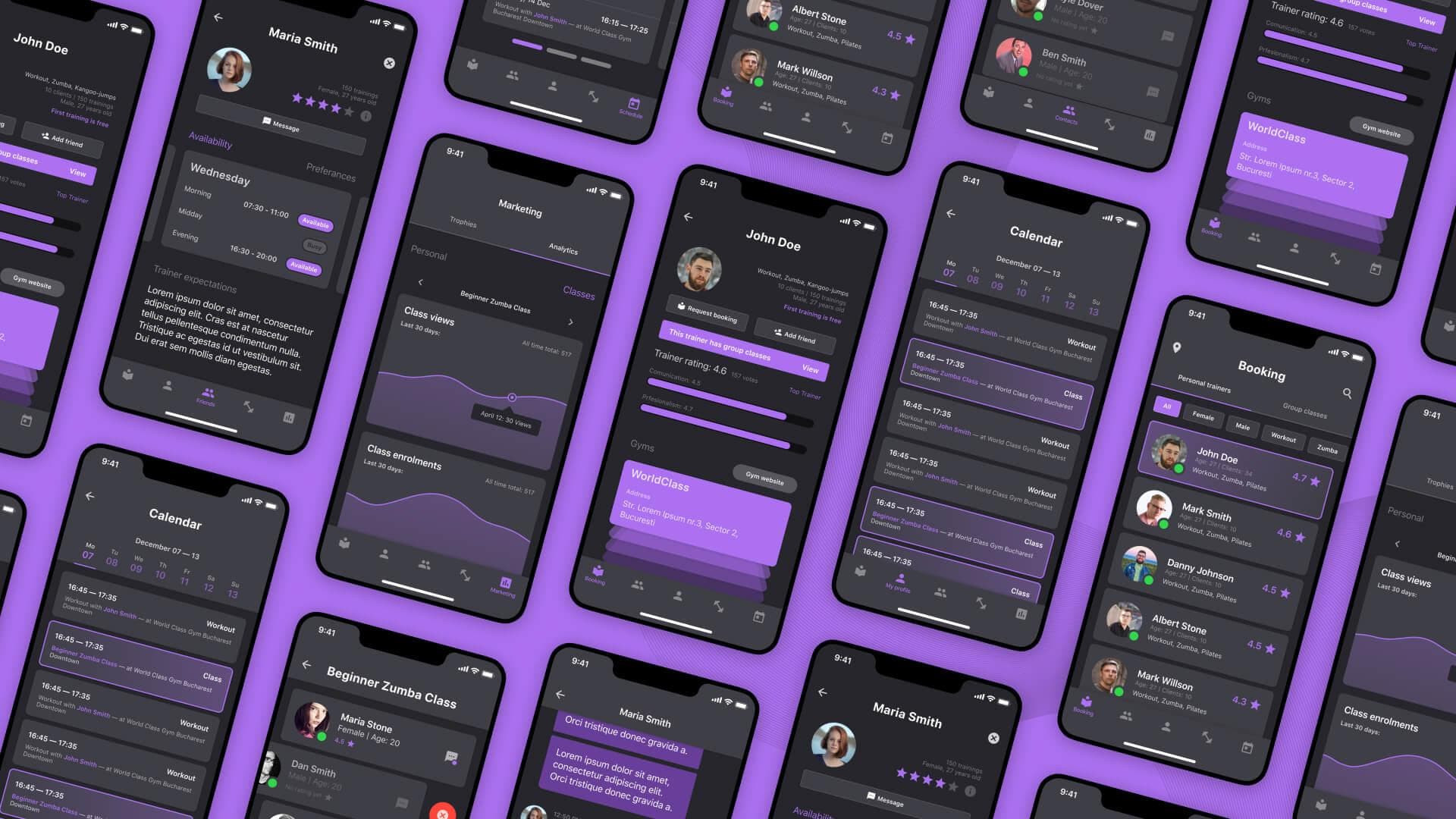
Fitness App UI/UX Design
Fitness Industry | Team: 1 Designer & 1 Developer
Visual overhaul and user experience improvements for a fitness mobile application targeting personal trainers and their clients.
Project Overview
When I joined this project the development of the application was already in an advanced state, but without any prior design. And while my initial role was to provide UI/UX guidance and small improvements in certain parts of the application it quickly became apparent that jumping right into the development process was hindering the experience, so we went back to the drawing board. We decided that the best approach would be to start over, this time with a proper design. With a major part of the app's functionality already defined and developed, it was a matter of translating that into a beautiful interface that would create a low friction experience for the users.
The Design Process
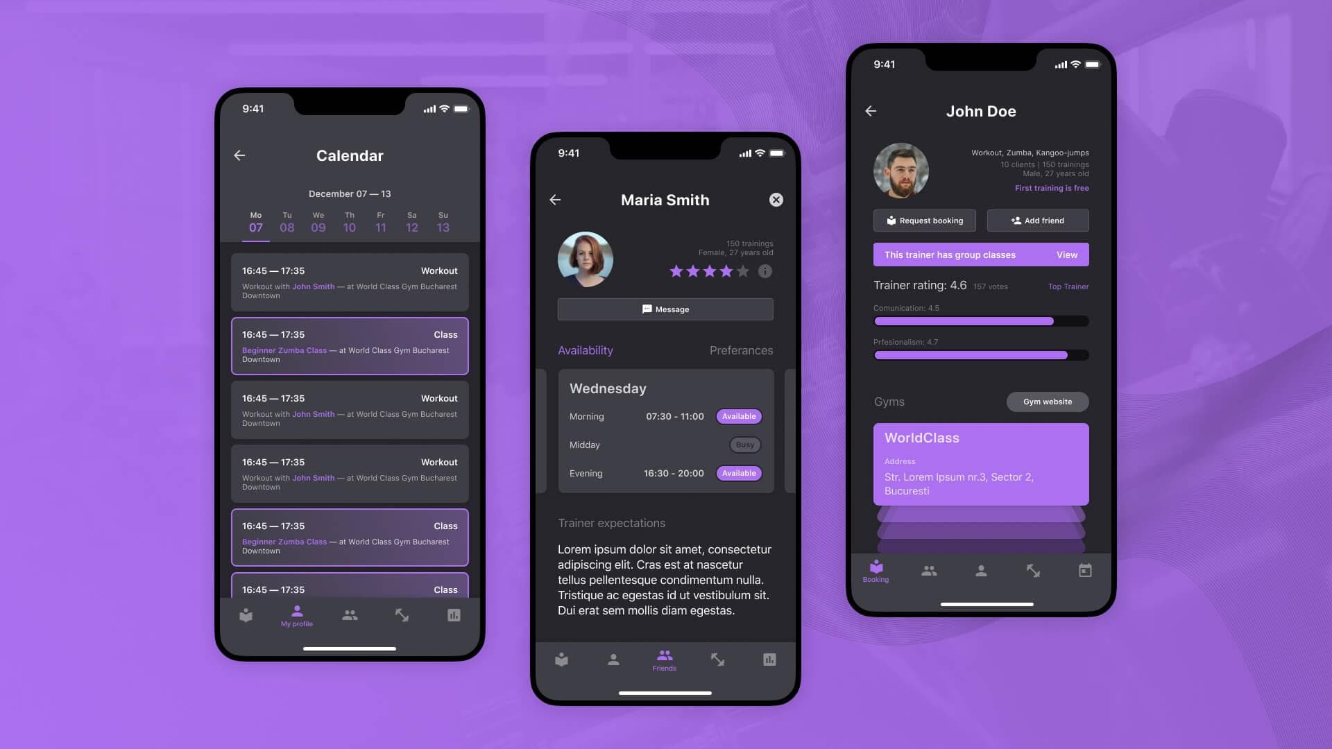
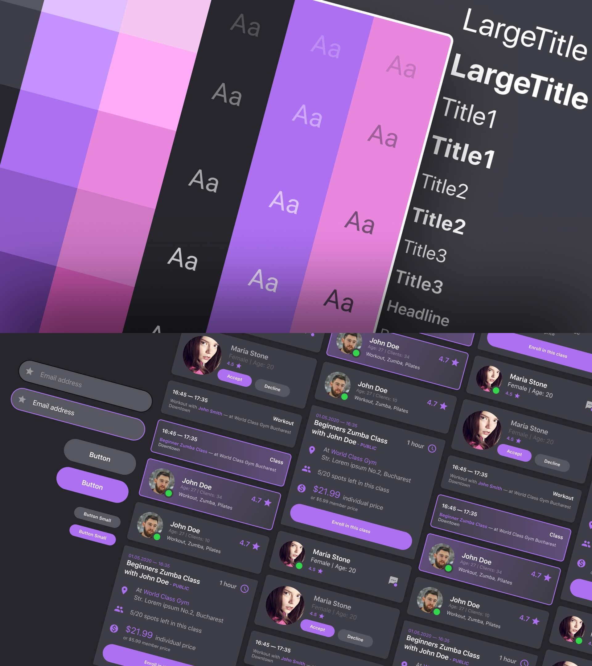
Knowing what features and functionality the application will have, I started by experimenting with designing some of the key screens of the app which allowed me to create a cohesive visual design system and a set of reusable components for the whole app. I took an iterative approach throughout this process incorporating feedback from the stakeholders and from test users in order to arrive at the final result.
Key Design Points
We wanted to accommodate both user types (clients & trainers) in the same app and to make everything as painless as possible for them. Below are a few of what I feel are the key points of the app.
Profiles
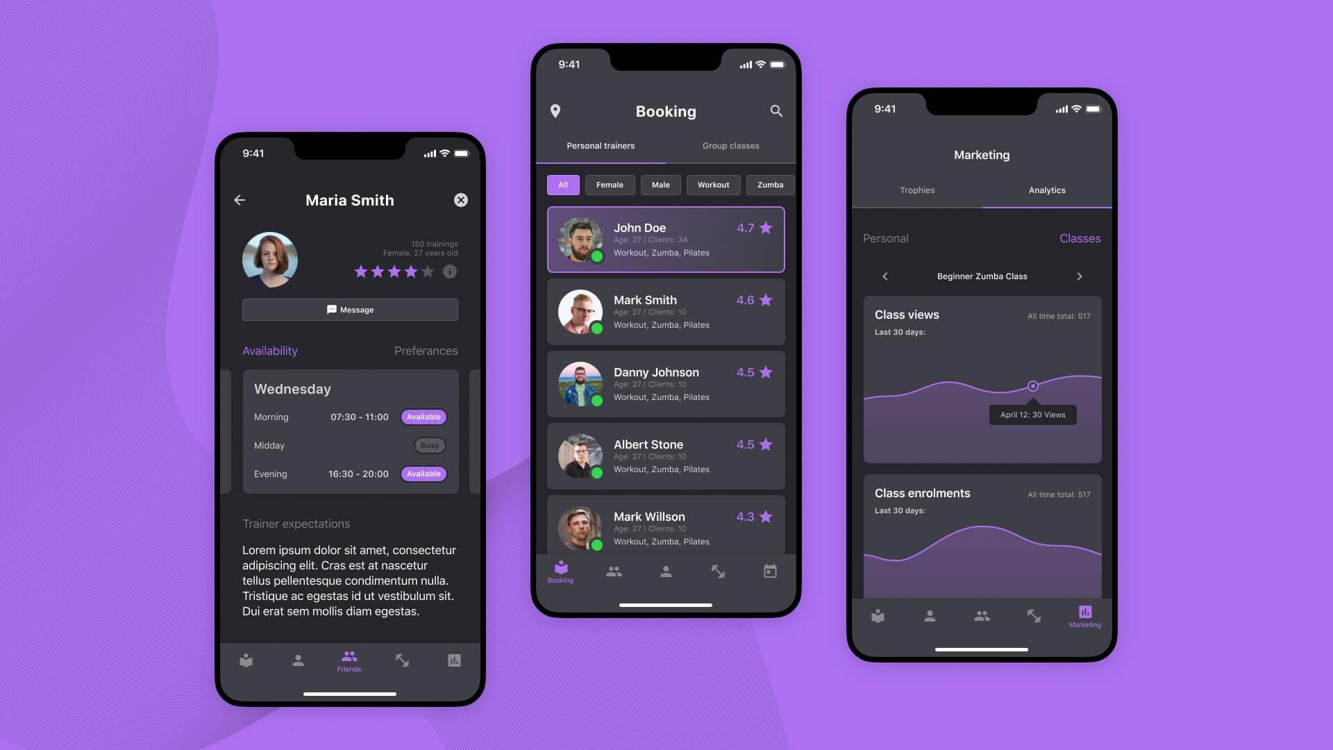
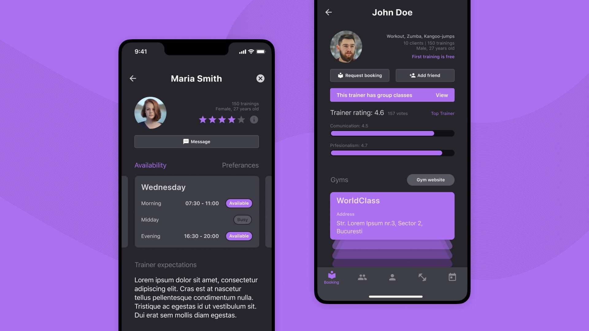
The profile screen is the main screen for both trainers and clients. For clients is the place where they set up their availability schedule and describe their expectations and needs for all the trainers to see. For trainers is the place where clients first land to check if they are a good fit. It displays things like their rating, what type of training they do or what gyms they train at.
Discovery
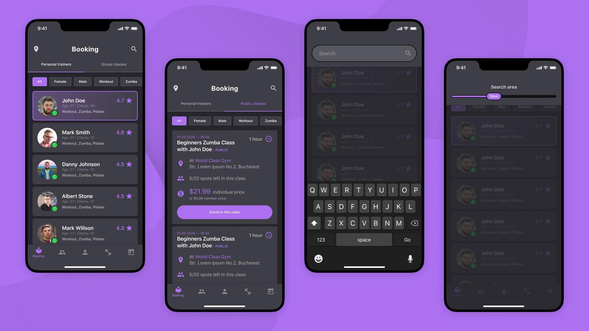
The discovery features are more focused on clients looking for trainers allowing them to discover new trainers or group classes through a range of search methods. They can search by keywords, specific locations or areas as well as various attributes of the trainers. Trainers can also discover potential clients and engage with them but in a limited way to avoid spam.
Collaboration
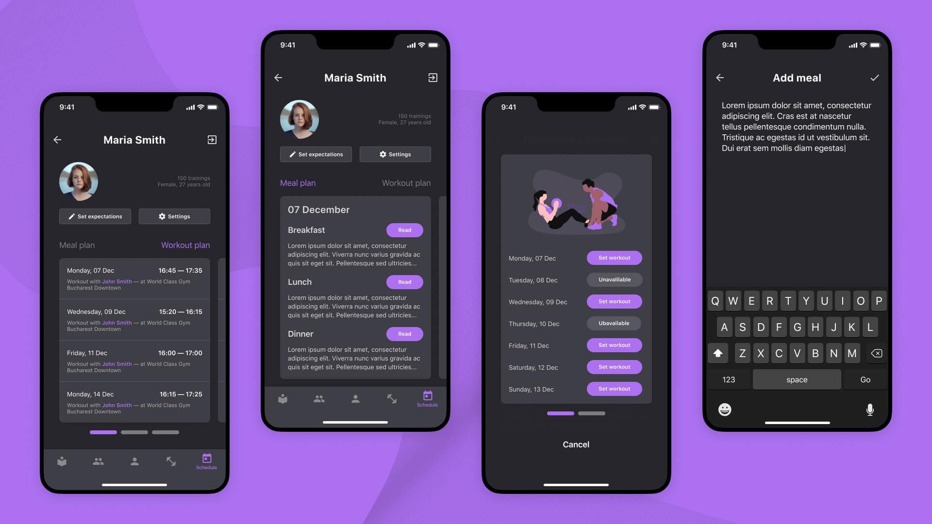
Once a trainer and a client start collaborating they can manage everything in the app. The client can set up an availability schedule and his expectations from the trainer while the trainer can plan workouts based on the client's availability and prepare their meal plan. They can also communicate and send updates through the in-app messenger.
Management
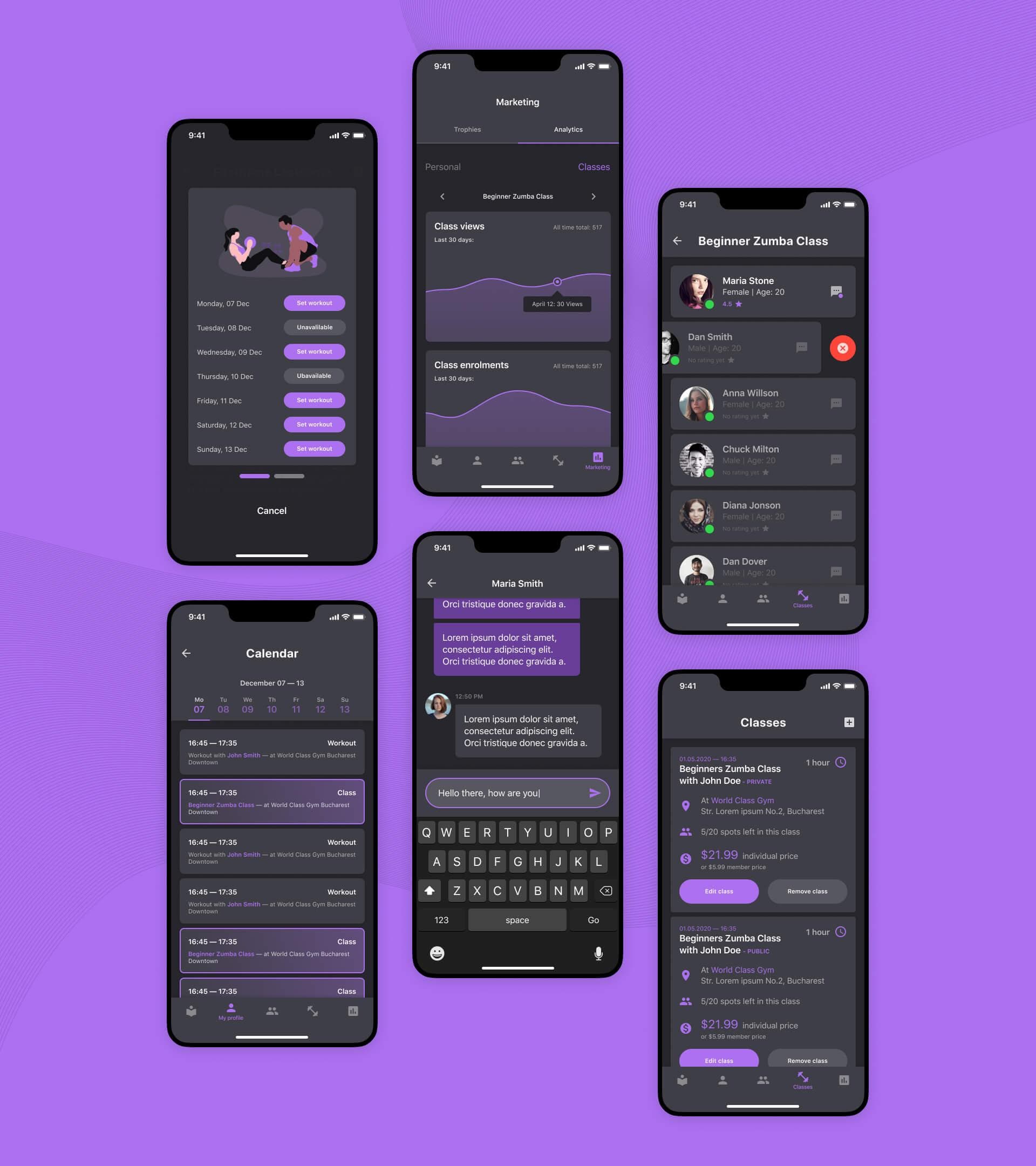
Trainers can easily manage their business through the app. They can keep track of each of their clients, create and manage group classes, stay organized with the in-app calendar and make informed decisions about their business based on in-app analytics.
The Outcome
The outcome of this project is a set of high-fidelity screen mock-ups illustrating all the features of the app and a fully developed version 1.0 of it.
